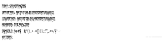
Horror display font for title work, released with open commercial use
Spiderfingers, by Chad Savage of Sinister Fonts, is a horror-themed display font intended to give titles a menacing, hand-lettered attitude. The font supplies aggressive, claw-like letterforms with sharp, uneven strokes and jagged serifs for headline use. Its visual scope targets graphic designers, horror enthusiasts, and event organizers who need a distinct, genre-specific title face for posters, album art, and seasonal promotions.
What purpose does Spiderfingers serve on a designer’s desktop?
Spiderfingers exists for graphic and specialty uses rather than continuous text; it was created in 2009 shortly after Halloween and is aimed at seasonal and genre-driven projects. Typical applications listed by the designer include album art, horror movie posters, and Halloween event promotions, making the font best suited to single-line or short-title compositions where a dramatic, thematic headline is required.
How much typographic coverage does the font actually provide?
The font ships with a measurable glyph set and a standard file format, which helps designers integrate it quickly. Key technical points include: 236 characters covering upper- and lowercase letters, numbers and symbols, and distribution as a TrueType (.ttf) file for broad compatibility. Practical result: designers can use decorative glyphs and symbols in titles without resorting to custom artwork.
Is installation and cross-platform use straightforward for a PC workflow?
Installation follows common font conventions: download the ZIP, extract the .ttf file, then right-click and choose Install on Windows. The file is compatible with desktop environments beyond Windows, including macOS and Linux, so teams working across platforms can share source files without converting formats. The straightforward install path keeps the font accessible for designers with standard toolchains.
Spiderfingers suits designers seeking a themed headline face, with one caveat
Spiderfingers is a practical, ready-to-use option for designers who need an aggressive display face, supported by a 100% free commercial license and wide distribution among horror communities. One consideration: the decorative, condensed forms are intended for short, high-impact titles and can reduce legibility at small sizes, so avoid using the font for body copy or dense typographic blocks.
Pros
Includes 236 characters, covering letters, numbers and decorative glyphs
Distributed as a TrueType (.ttf) file for broad platform compatibility
Condensed, high-impact letterforms that work for compact titles
Cons
Reduced legibility at small sizes, not suitable for body text
Aggressive, genre-specific style limits general-purpose use
Condensed letterforms constrain spacing in long headlines
Laws concerning the use of this software vary from country to country. We do not encourage or condone the use of this program if it is in violation of these laws. Softonic may receive a referral fee if you click or buy any of the products featured here.